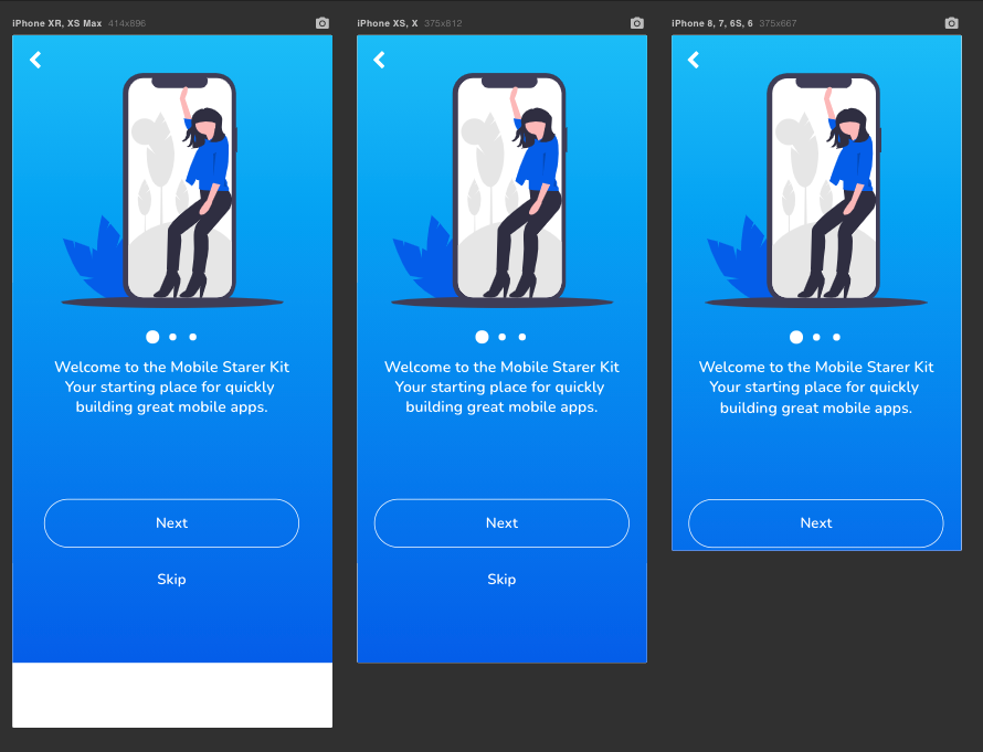
Optimising Bubble apps for mobile screens
Welcome to the first issue of the bubbleHacks newsletter 👋
Let’s talk about building for mobile on Bubble. More specifically, making sure your app looks good on all sizes of mobile screens.
You have probably been there: If you develop for mobile on Bubble, you often end up getting something like this:
When actually what you want is more something like this:
The reason is that Bubble only has absolute positioning using coordinates (X, Y) that position the element relative to its parent. While this makes the development very easy and is often good enough for apps rendered on a desktop, it gives us very little flexibility when developing for mobile.
However, with a little bit of tweaking and a few lines of CSS code, we can fix this quite quickly. Interested? Check out my 7-minute tutorial on how to do this:
Last but not least
Do you want me to write about a specific topic, or do you have an awesome Bubble hack you would like to share? I'd love to hear from you, and I'm looking forward to engaging in the post comments or the Bubble forum.
That’s it. See you in two weeks.
Keep it simple!
Damian


Here are the code snippets:
<style>
.fullHeight {
height: 100vh !important;
}
.largeScreen {
padding-top: 100px;
}
</style>
{addClass: "fullHeight"}
{removeClass: "fullHeight"}
{addClass: "largeScreen"}
Hi, it doesn't work for other groups, why?
Greetings