
Adding Font Awesome Icons to Bubble apps

In today's issue:
To build or not to build?
Make your apps look a tiny bit nicer using Font Awesome Icons
To build or not to build?
At first, I was not sure whether I wanted to write about this, but I think we should talk about it. With the advent of no-code, it has become almost too easy to start building based on theories without validating the customer problem first, ending up creating something nobody wants to use. Although I know this incredibly well from my work as an early-stage VC, I still failed to do it in pretty much all of my side projects. The temptation to just start building is enormous, and building on Bubble often feels much more comfortable than talking to customers. After repeatedly building stuff nobody wanted to use, I learned to keep this on top of my mind and eventually got better at it. Although this newsletter primarily focuses on technical Bubble challenges, I decided to occasionally include pieces on evaluating app ideas, testing your hypotheses with target customers, and building audience-first. Stay tuned.
Make your apps look a tiny bit nicer using Font Awesome Icons
Initially, most people used no-code to build MVPs and then later rebuilt their apps using actual code. However, more and more startups are staying on Bubble and use it in production mode. But here is the catch: While building an ok UI using Bubble is straightforward, creating a great one can get quite challenging. And the devil is in the details.
So today, let's make our apps look a tiny bit nicer using Font Awesome icons and color gradients.
Font Awesome is a freemium vector icon library used by almost all designers and developers worldwide. It is also the basis for the standard icon elements in Bubble. So, what's the problem?
Currently, Font Awesome has 1'608 free icons and another 7,864 PRO icons. In the Bubble editor, you can only access about 800 of those.
The styling options in the Bubble editor are limited to size, color, background, and shadow. Using the actual Font Awesome library gives us much more options, as we can use CSS to style our icons.
So how can we use the Font Awesome library in our projects? There are several ways to do so. Here is my favorite one, using the HTML element:
1) Head over to https://fontawesome.com/start and create your first Kit. You should then get a line of code, the 'Kit Code' that we will later include in our Bubble app to register it with Font Awesome.

2) Browse the Font Awesome library and find icons you like. Once you find one, look for its classes and copy them - just the red-underlined part (e.g. "fas fa-address-card"), not the gray text around it.

3) Head back to your Bubble app, grab an HTML element from the editor sidebar and place it where your icon should go. Copy and paste the following code into your HTML element:
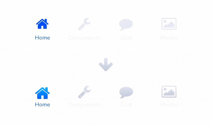
<center><i class="fa fa-home" style=" font-size: 35px; background: -webkit-linear-gradient(#D6DBE3, #B8C0CE); -webkit-background-clip: text; -webkit-text-fill-color: transparent;"></i></center>4) Make the following adjustments:

4.1) Add your Kit's code from step 1 on top. This registers your app with Font Awesome. Without this, the icon will not display.
4.2) Replace the icon with the one you want (see step 2; e.g., "fas fa-address-card").
4.3) Adjust the icon size as needed (e.g. 20px;).
4.4) Adjust the color gradient colors (e.g. #D3DBE3, #B2C0CE).
5) Add conditions as needed.
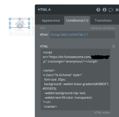
That's pretty much it. Feel free to have a look at my example editor setup.
Note: If you do not have a Font Awesome PRO license, PRO icons won't show on your page.
Last but not least
Do you want me to write about a specific topic, or do you have an awesome Bubble hack you would like to share? I'd love to hear from you, and I'm looking forward to engaging in the post comments or the Bubble forum.
That’s it. See you in two weeks.
Keep it simple!
Damian
it's crazy how small things like this can upgrade the whole look of an app. thanks for the tip 💪🏾